By Kristen Schwartz, Design Consultant
What a difference paint can make! The wrong shade of the right color can turn a room from warm & welcoming to stark & cold; the color of your paint can have a tremendous impact on the overall ambience of your space. Let’s explore some Sherwin Williams colors guaranteed to cozy up your home.
Garret Grey – 6075
With almost magenta undertones, this walnut brown envelopes a room in warmth. It’s a color you can layer easily with paint, furniture, wood stain & textiles. This soft paint color would be stunning as an accent wall or as the backdrop in a room with lots of cream, light yellow & mossy green accessories. Add in some brassy pieces to punch up the glam or use black for a more reserved feel. Green plants, real or not, will add another layer of coziness.
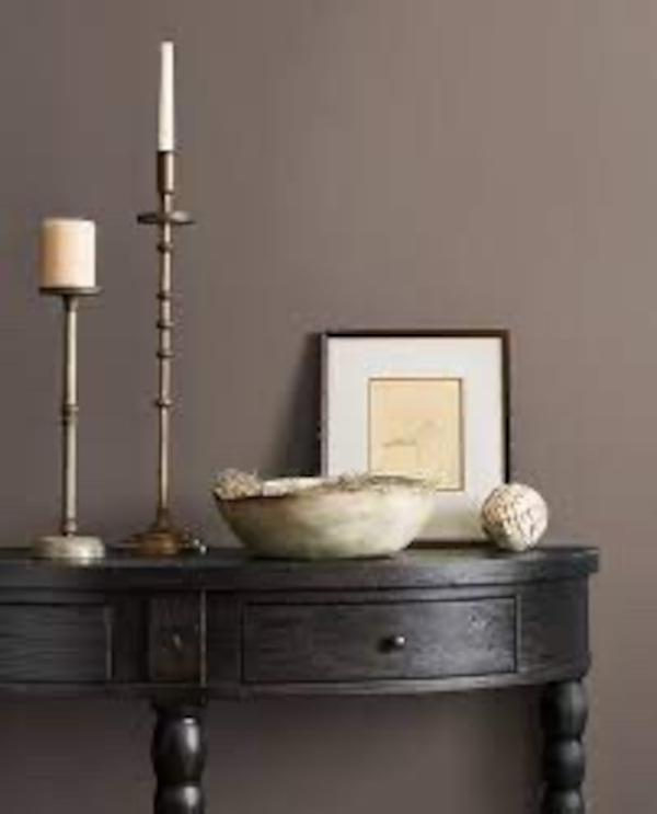
Taupe of the Morning – 9509
For those of you who are still holding on to your “pandemic gray” infatuation, Taupe of the Morning is a nice baby-step out of your comfort zone. This beautiful “greige” cousin is a subtle neutral with just the right amount of tint & warmth: it will never go out of style. I do recommend using taupe in larger rooms with a decent amount of natural light. Taupe of the Morning is a perfect backdrop color: use it in a bookshelf, as a complement color in two-toned cabinets or contrast your doors & trim by painting the doors only. Talk about a subtle statement!
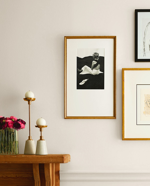
White Sand – 9582
With over 100 shades of white paint to choose from, finding the perfect white can seem impossible. This white (as well as Marshmallow 7004) lets you have your white paint & a cozy aesthetic too. White has become a favorite of mine & our clients because it has the perfect undertones to come off as soft, not stark. It’s also the perfect backdrop for colorful art or a sofa in a statement color.
Sea Mariner – 9640
This is a fantastic color to bring warmth to your home. Use it on cabinets, bookshelves & any wall where you want to up the coziness factor. Want to turn a bedroom into a cocoon? Paint the wall, ceiling & trim in this great neutral. Sea Mariner pairs well with crisp whites, sunny yellows, tomato reds, grassy greens, light lavenders, pale & bold pinks, oranges – I could keep going, but you get the gist!
Grizzle Gray – 7068
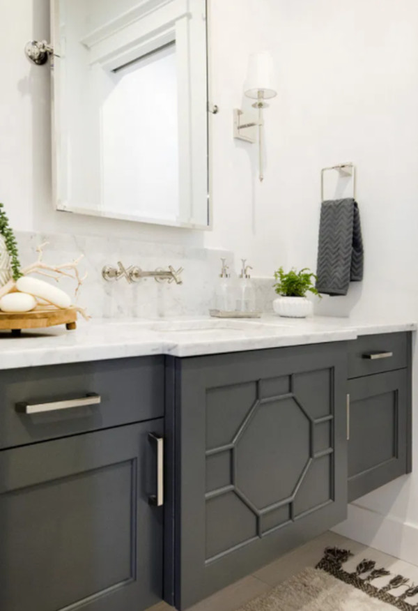
his lovely gray can lean warm or cool; it can add just the right amount of drama without being over the top. It reads nice & dark with minimal natural light but turn soft & light with a direct hit of natural light. Grizzle Gray can definitely look green as that’s its strongest undertone. But it’s a cool green, so more a green-blue, which takes it away from the more olive-green & warmer gray-green blends. It looks great on cabinets, accent walls, really any space big or small!
Black Magic – 6991
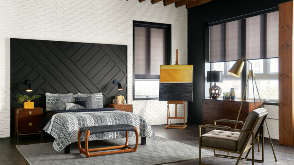
Black Magic is one of those rich colors that offers neutral undertones with a feeling of softness. Cozy with the wow factor homeowners are looking for these days. In the photo (left) Black Magic is used on the headboard wall & the accent wall around the windows. Use this color on kitchen or bar islands, vanities, built-ins or in any oversized room.
Paint is truly magical; it has the power to completely alter the look & feel of a room. Be bold in your color choices! It’s only paint so it’s relatively inexpensive & easy to change as your likes change over time. Built by Design clients work with me to make paint color decisions so that their newly remodeled spaces exude their unique personality & coordinate with the overall design aesthetic. We’d love to be part of your next remodeling adventure. Visit us at BuiltbyDesignKC.com to learn more about us & to fill out a Request a Bid form.